Image Formatting for the Web
We all remember those days when we would sit there and wait for our internet to connect with that awful dial up sound and then view those simplistic websites that would load slow, even with minimal images. The internet has come a long way since then and most of us have super high speed internet connections at home and at work. Even our cell phones can load websites with all kinds of eye candy hundreds of times faster than ten years ago. Not everyone has these super high speed connections in the United States, and especially in a lot of places around the globe. Sure we all have heard about some of those Asian countries that have internet connections 10+ times faster than the average broadband user here, but overall most people still do not have as fast of a connection as you might think.
I am a graphic and web designer who is all about making things look pretty and giving the user a great visual experience. Sometimes for usability purposes, you have to make some sacrifices on the visual side.
Slower connections do not like sharp and fancy images all over the place. This does not mean that you shouldn't have a lot of images on your website, but means that the appearance of your website is held hostage by the purpose of your website and who will primarily be viewing it.
For audiences who are typically younger and more "hip" with all the latest technology, I will go to town with designing a site with images with very little web optimization... meaning they will be super sharp and have very smooth edges. Sites designed for a wider audience (which is generally how it is), I will optimize the images a lot in order to keep the load times down. For international audiences, a site might end up with images even further optimized.
Most people when they hear the word "optimization," in reference to the web, they tend to think of SEO (search engine optimization) but optimization is also used with images to better the load time of a website. Image optimization is all about compression and the use of less and less colors.
Higher quality images might have thousands and thousands of colors used to render that crisp looking image. When optimizing your images, popularly through Adobe Photoshop, mostly what is happening is colors that are similar to each other are getting changed into the same color value. As you decrease the amount of colors used, it is eliminating more and more information within that saved file that assigns each specific pixel to be colored what it is colored. In doing this, the quality of the image is decreased as well as the file size of the image. The smaller the file size, the faster it loads... making it better for people with slower connections. The art comes in where you are able to decrease the file size enough and still keep most of the quality of the image. You want to decrease the size of the file just enough so that it loads fast while making it so that it is really not noticeable that the quality of the image has decreased.
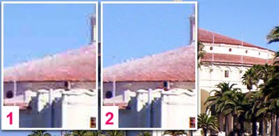
Above you will find a photo where Figure 1 and 2 display different image qualities. Both are optimized and enlarged to show a little more detail. You will notice that Figure 1 has a lot more pixelation/fuzziness where the red of the roof meets the blue sky. This is because the image has mostly red, white, and blue colors in it and similar colors are banded together and the additional colors, mostly the ones used in the transition from red to blue, are missing in order to crunch the file size. Figure 1 is about 1/7th the size of of Figure 2.
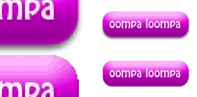
Deciding what file format to output your image as can really play with the appearance of the image and the file size. In the image above with the attractive purple buttons, the top button is outputted as a PNG and the bottom is a GIF. You will notice that the optimized GIF does not allow as smooth of a transition in the purple gradient and the edges look a lot more pixelated. This is because a lot of those extra colors are missing and the edges of it are a lot more jagged. The GIF does allow transparency, also known as an alpha channel, but all color must be 100% there or not there at all. The reason why the PNG has much more smooth edges has to do with it allowing different percentages of color in the pixels that appear transparent. This will allow this image format to have that nice drop shadow and the smooth edges because it will have pixels next to where it would have jagged edges, if it was a GIF, that are slightly colored differently and of a percentage of transparency. This is able to appear to be of a higher quality and smoothness since it has those extra pixels and transparency to fill in the gaps where the eye would see a jagged edge. Adding these extra pixels is known as "antialiasing." The PNG is about 7 times the file size of that GIF and overall adds a lot more pizazz to the appearance of the button.
I will always first pay attention to the purpose and audience of the website I am designing but will always try to allow things to look a little bit better, even if the user has to wait a few more moments for the site to load. People know if they have a slow connection and are used to waiting for more modern websites to load more than if they were on a faster connection. A usability expert might disagree with me, but I feel that it is OK to preserve a little more quality in order to give an overall better visual experience.
posted by Chris Kirkman at
9:59 PM
![]()
0 Comments:
Post a Comment
<< Home