
Graphic Design DOs and DON'Ts: V1
Number 1: Strokes and Outlines
Note: This has to do with Illustrator CS and below. CS2 has a quick fix to this problem.
I see this mistake a lot from designers who do not have a lot of experience and/or training. When designing in Adobe Illustrator you will find yourself needing to outline or put a stroke around some text. This should most definitely not be done to body text but only to a headline or title.
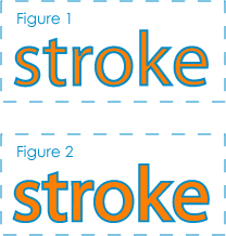
There is a right way to do this and a wrong way to do this. The right way to do this (see Figure 2) is to create your text, outline it (select text>Type>Create Outlines), copy text (ctrl+c on a PC and apple+c on a Mac), paste text behind (ctrl+b on a PC and apple+b on a Mac), and then give that text/object a stroke. Since the object/text is now behind the original you created the stroke will appear to be half as thick as what you set it to. You will at this point need to double the weight in the stroke pallet to get the weight you are looking for. You might think that ctrl+v (apple+v on a Mac) is what you want to use to paste you copied text. This will work to paste anything you copy in Illustrator but since we want to send what we are pasting to the back of what we copied we will hit ctrl+b. In case you were wondering, ctrl+f (apple+f on a Mac) will paste it in the front.
You might be wondering why this is the thing to do. Take a look at Figure 1. If you just simply put a stroke on your text it centers the stroke on the edge of your text. This cuts away from the inside text itself. In Figure 2 you will see that placing the stroke behind the text lets you keep the stroke/outline size you want but it does not cut away from the text inside.
This is only a fix for Illustrator CS and below and CS2 has its own way to fix this problem. All you do is create your text and apply a stroke on it. After you do that you take a peek at your stroke pallet and look for Align Stroke (below Miter Limit and above Dashed Line). There you will find three boxes you can select. One has the stroke applied to the outside of the text/object, another to the inside, and the other to the middle like the standard pre CS2 has it.
In Photoshop
This is easy. Like in Illustrator you do not want your stroke/outline to be applied to the inside of your text but the outside. You will find this fix in the settings when you are about to apply your stroke.
A General Rule
Always outline your stroke in Adobe Illustrator when you’re done with the primary design of what you are using it on. The default settings in Illustrator have you not scaling your stroke when you resize your object. You can go in there and change these settings easily but as a good rule you should always outline your stroke.
There will be times in your design career when someone else (a lot of the time less experienced than you) might have to work with a file you created or the other way around. With the object with a stroke on it outlined, you can scale it to the size you want and it will preserve the stroke weight in relation to the size of the object (in other words properly scale the stroke as it scales the object). This will keep things looking the same and this can be a help when you are crunching for a deadline.
If you do decide you want the stroke to be fattened that is already outlined all you have to do is delete the outlined stroke and re-apply another one to it at the desired weight.
Number 2: Illustrator vs. Photoshop
Photoshop
This program is great. It is the best application for editing images and works primarily with pixels. A limitation with pixels is that the pixel-based image is not to be scaled since all you are doing is enlarging the squares/pixels which loses quality and clarity.
If you are a web designer you will work very closely with Photoshop for different elements and graphics of your website… even for Flash. If you are working to produce print you will only use Photoshop to create images that will be imbedded into Illustrator or a layout program such as Quark. Photoshop should not be used to produce text for print and should most definitely never be used for the production of corporate/company logos.
Illustrator
This program is also great but is not a pixel-based image editor. Illustrator works mostly with vector graphics. This allows the image to be able to be scaled to just about any size and keep its integrity. As a result logos should always be produced/finalized in Illustrator. You will be able to scale them to just about any size you like.
You can even produce graphics for the web using Illustrator and a lot of the time I have found myself doing this. Since you can output to many pixel-based files, you can make extremely smooth looking graphics and convert them to a JPEG or other raster files.
For print this can act as a layout program. You would take your images edited in Photoshop (most of the time high resolution TIFF files) and place/embed them inside your document. In Illustrator you would then create all your text and shape designs as well as add your logos and other things like that. Just follow this simple rule: in print use Photoshop for your image editing and then do everything else in Illustrator.
posted by Chris Kirkman at
12:02 AM
0 Comments
![]()